

Good motion in an interface is mostly unnoticed. A sheet slides up from where you tapped, so you know where it came from and where it will go. A deleted item collapses, so you see the list close the gap rather than jump. Motion like this answers questions before people ask them: what changed, where did it go, what can I do now?
Bad motion is noticed immediately: the loading spinner that plays a little too long, the bouncing button, the page that slides in when it could simply appear.
Every animation needs a job
Before adding motion, we ask what it explains. There are only a few good answers:
- Continuity: showing that this new view came from that button.
- Feedback: confirming that a tap, swipe or save registered.
- Attention: drawing the eye to something that changed and matters.
- Character: a moment of personality, used sparingly, where nothing urgent is happening.
If an animation doesn't do one of these, it's decoration, and decoration has a cost every time someone uses the product.
Fast, and eased
Most interface transitions should be quick, often between 150 and 300 milliseconds. Small elements move faster than large ones. Things entering the screen should decelerate as they arrive, and things leaving should accelerate as they go, the way objects in the physical world start and stop. Linear motion looks mechanical.
We keep durations and curves as named tokens, just like colors and type sizes, so motion feels consistent across a product instead of being tuned screen by screen.
If people notice the animation, it's probably too slow.
Respect reduced motion
For some people, motion on a screen causes real discomfort: dizziness, nausea or headaches, especially with large movements, parallax and zooming. Every major platform lets people ask for less motion, on iPhone with Reduce Motion and on the web with the prefers-reduced-motion media query.
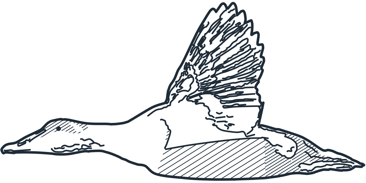
Honoring it doesn't mean removing all feedback. We replace large movements with gentle fades or instant changes, stop decorative and looping animation entirely, and keep the information the motion carried. On this website, for instance, the flock of eiders crossing the sea stops when reduced motion is on, and a single still bird remains.
Never make people wait for an animation
Interfaces should accept input while they animate. If someone taps the next item before a transition finishes, the interface should follow them, not finish its routine first. Interruptible animation is one of the clearest signs of a well-built product.
Motion is part of the design system
We design motion alongside layout and color, not after. A few tokens for duration and easing, a short list of standard transitions and a written rule for reduced motion are enough to keep a whole product coherent, and to make the occasional moment of delight feel intentional.
Read more in the journal, or see how we work.